Your Custom Text Here
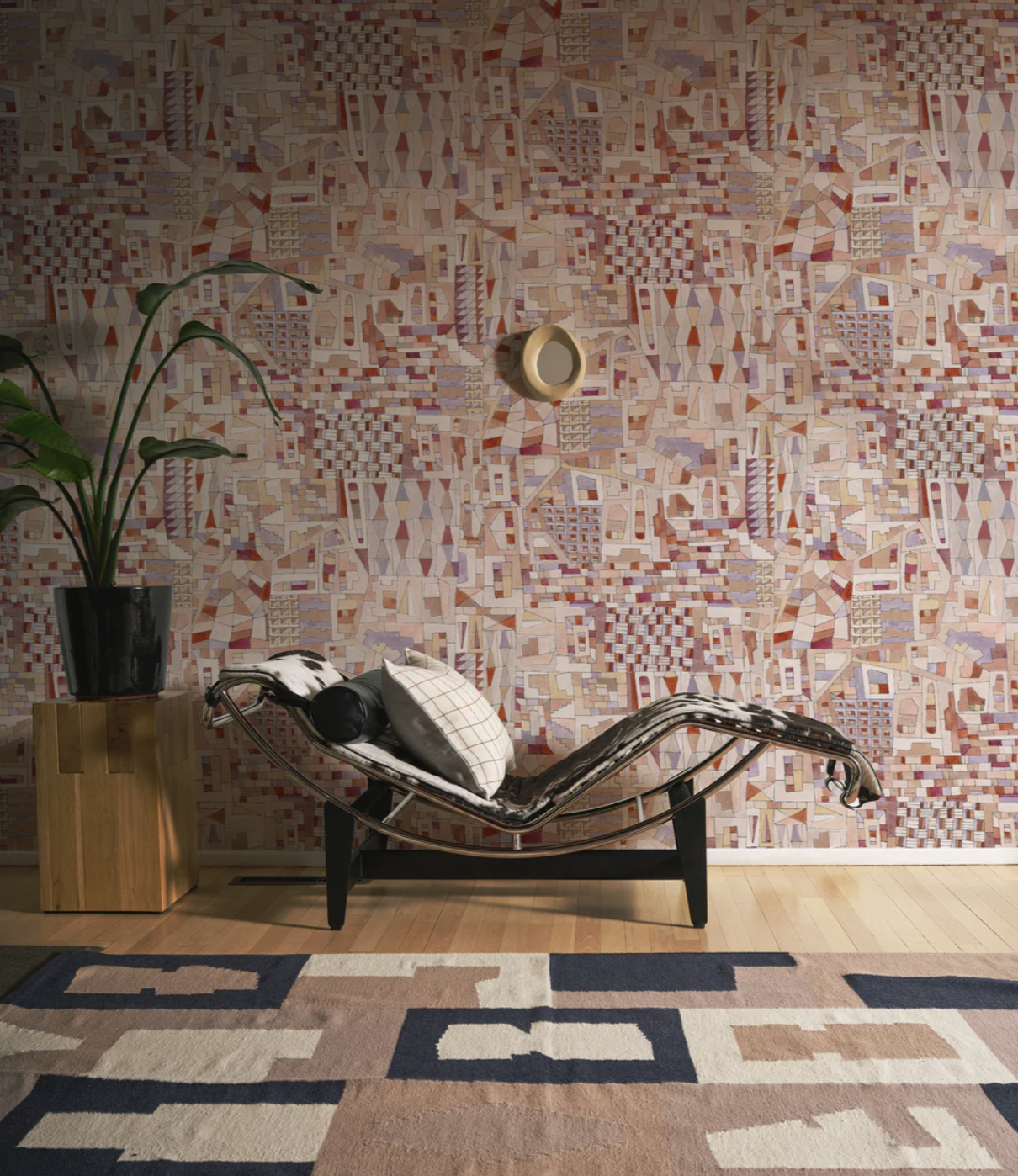
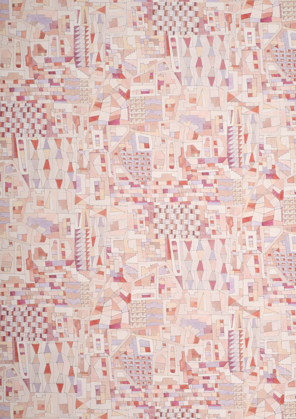
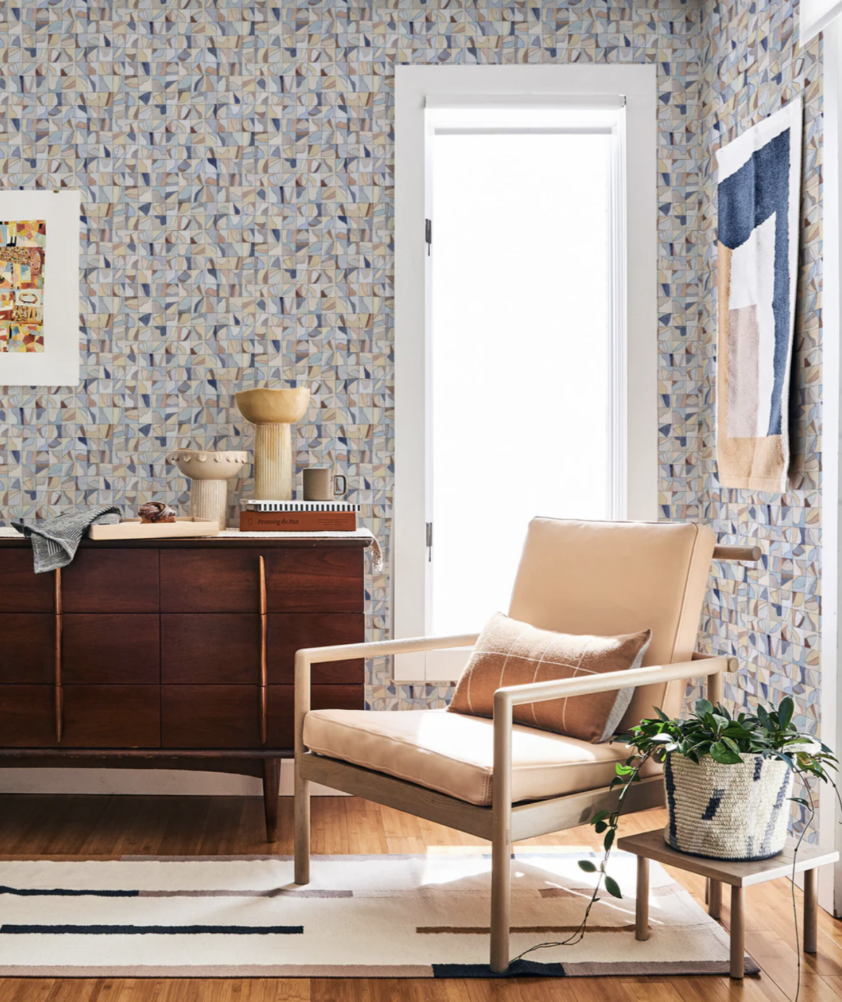
NEW WALLPAPER FROM MINNA!
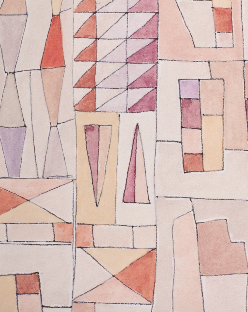
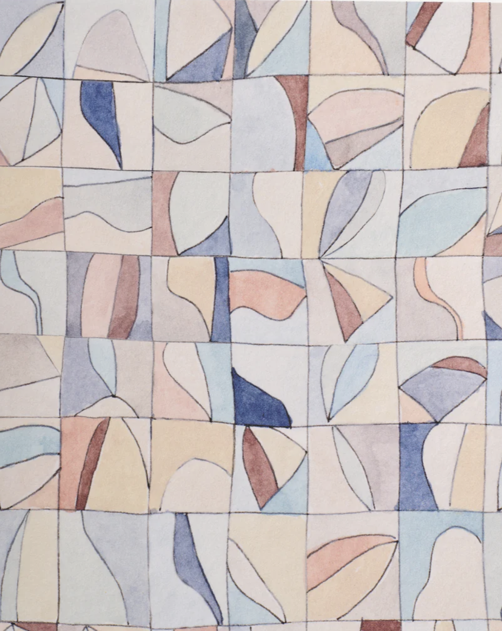
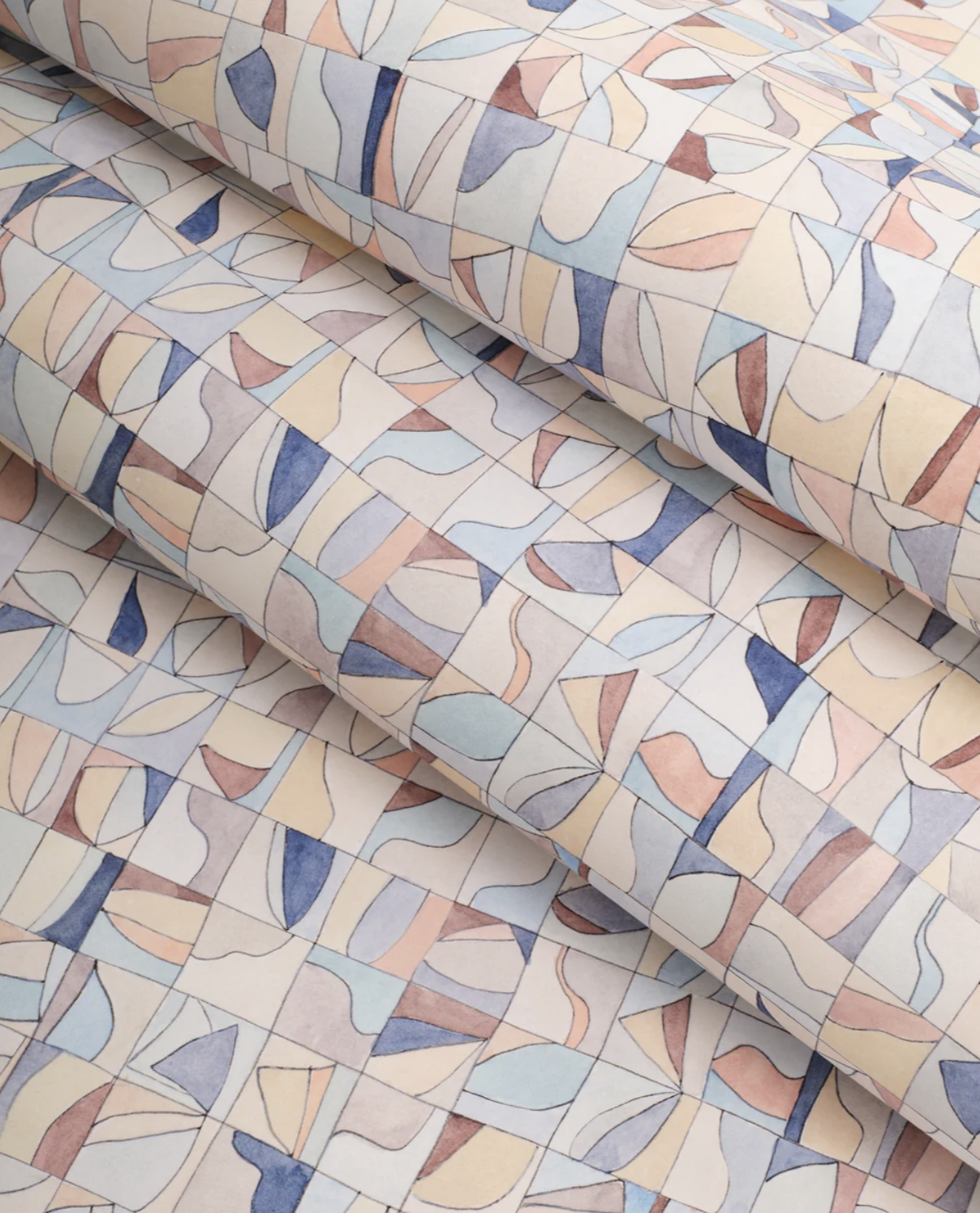
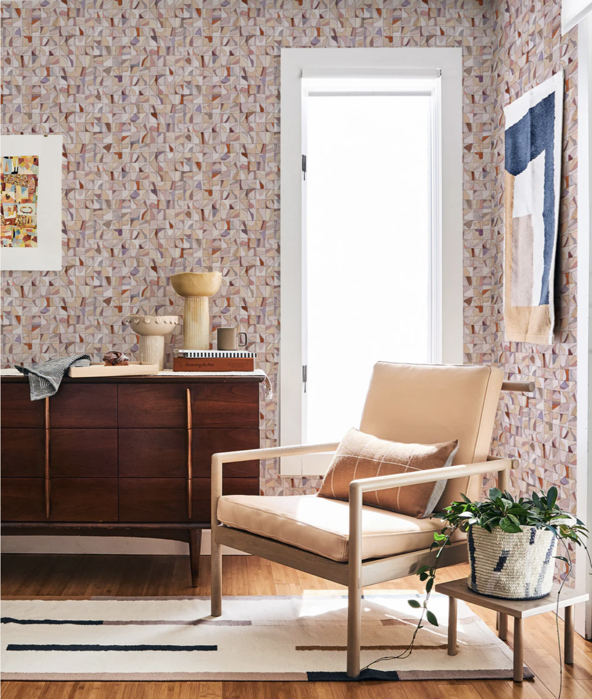
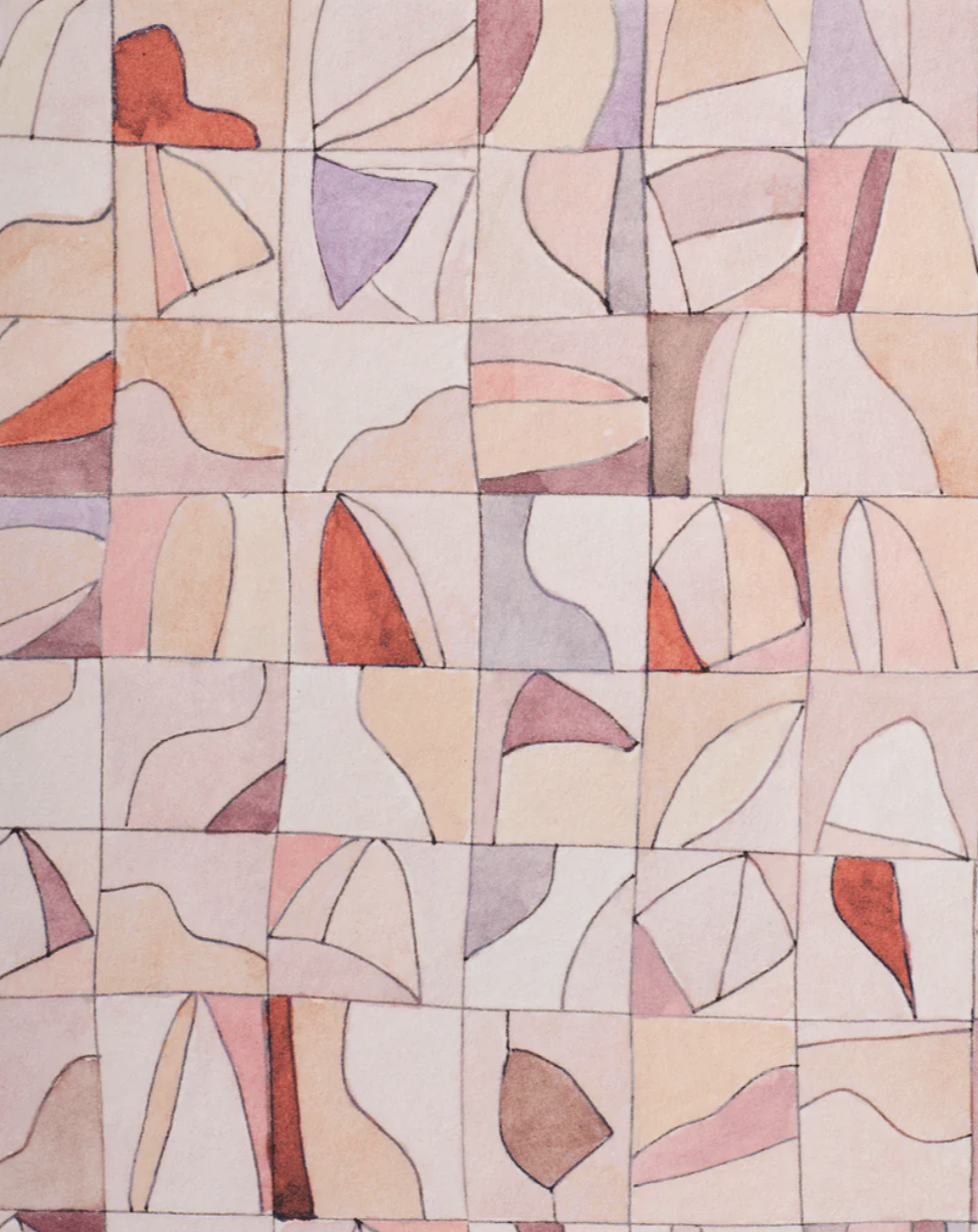
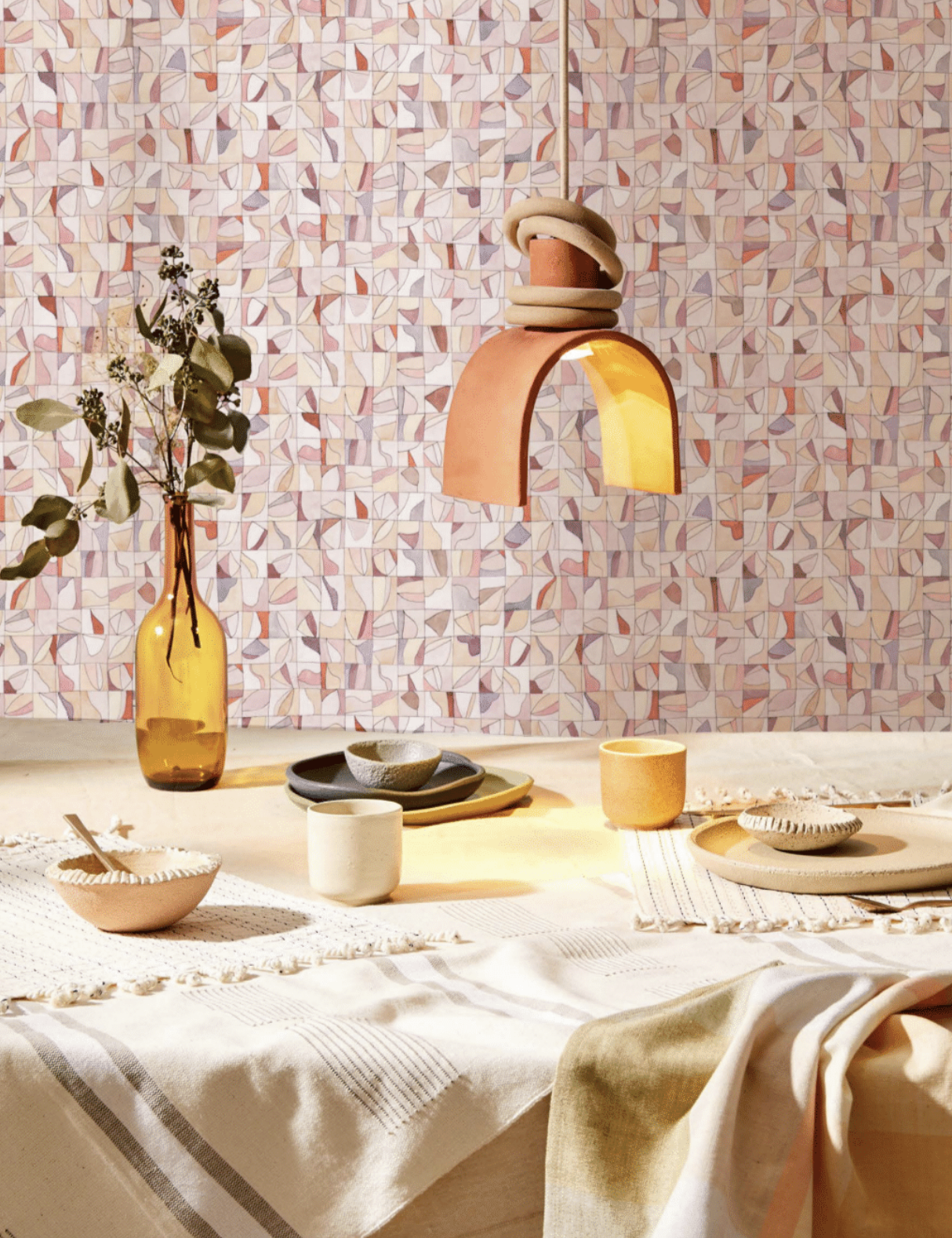
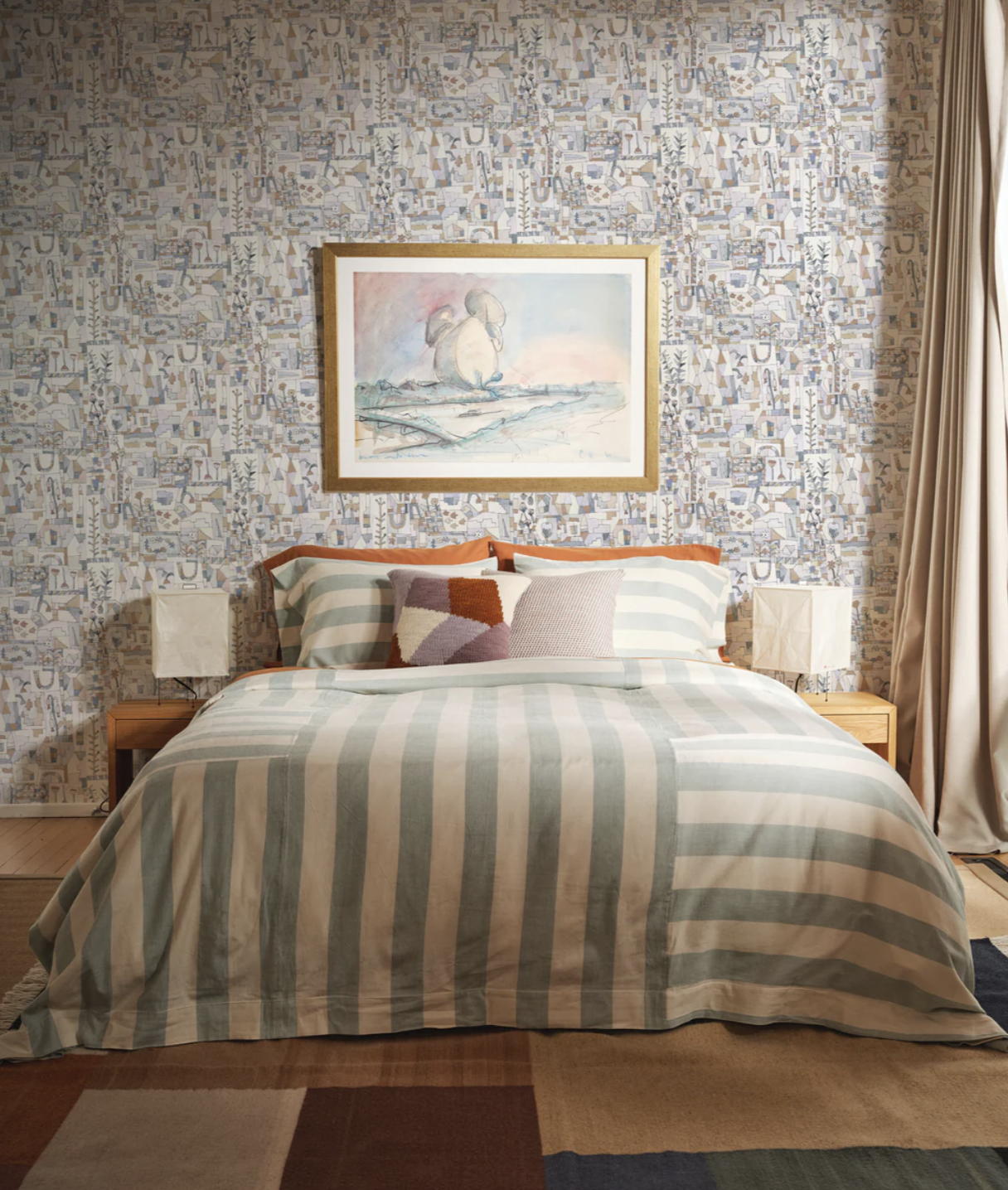
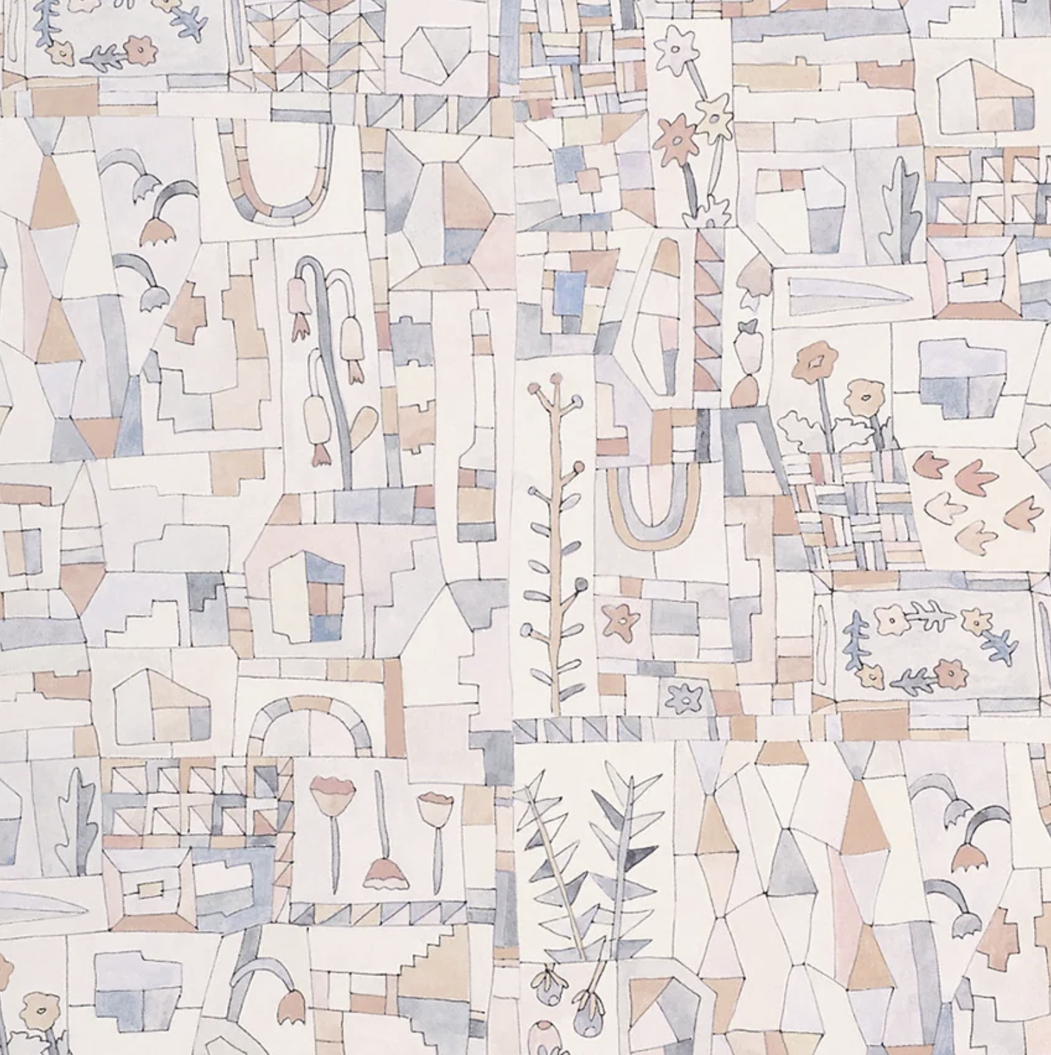
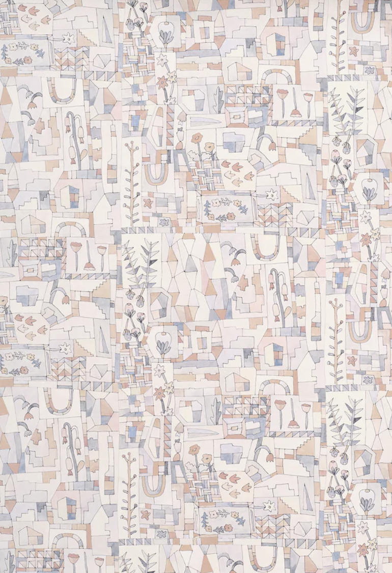
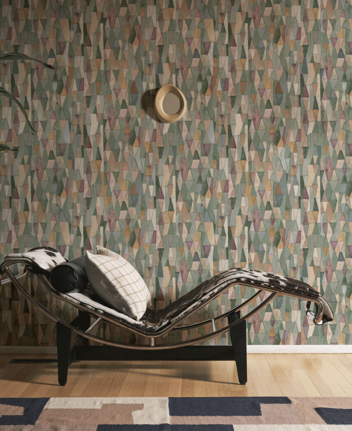
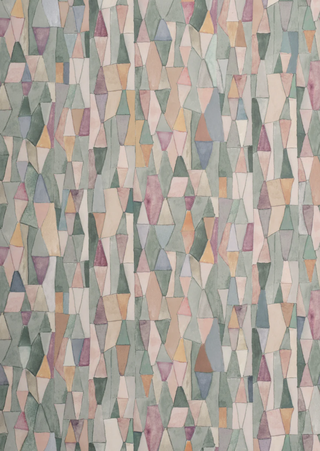
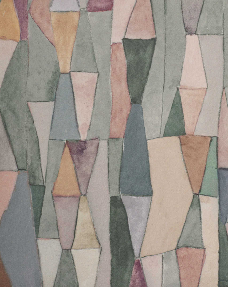
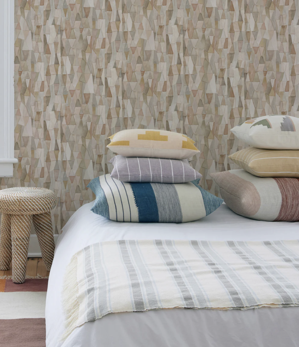
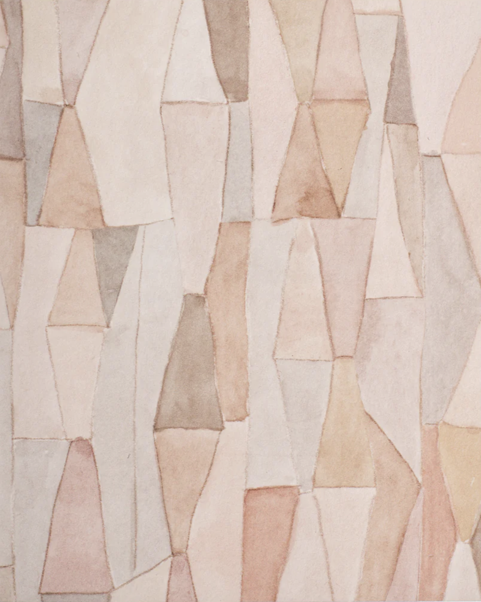
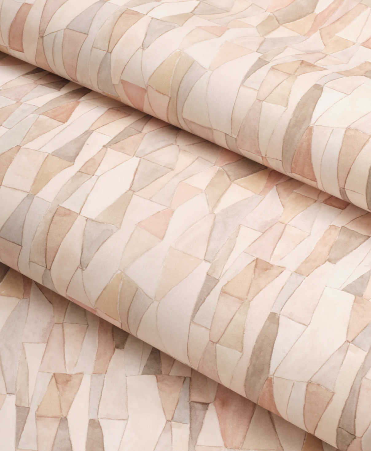
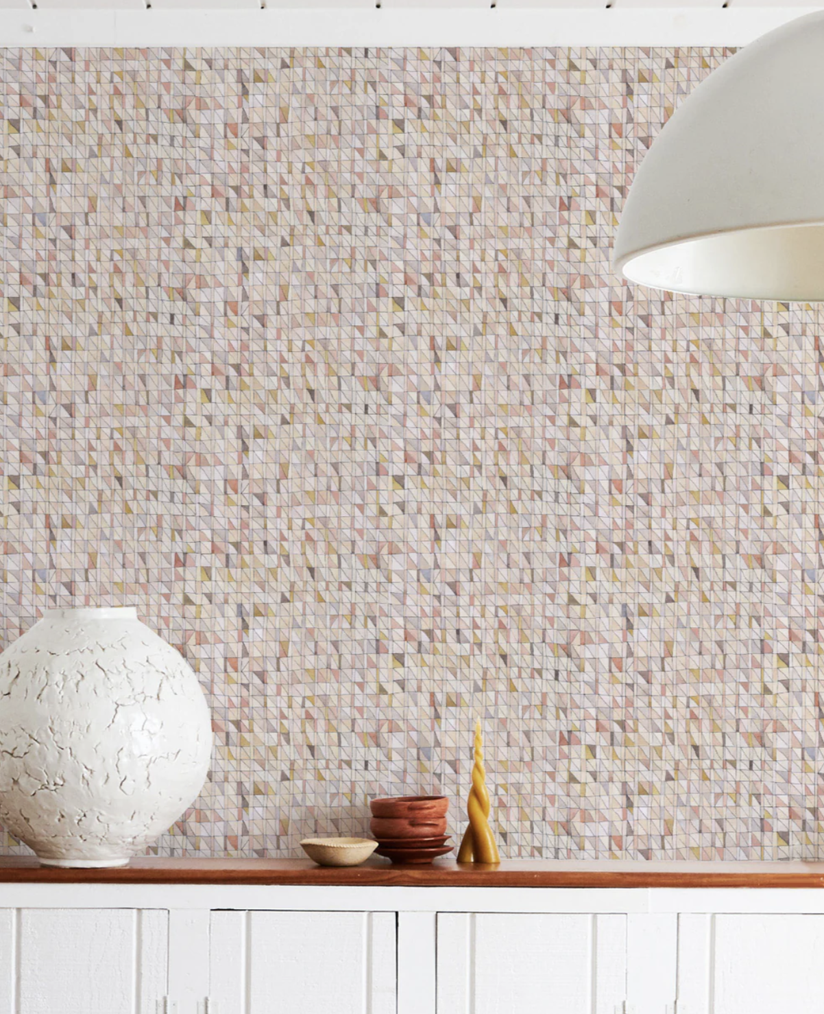
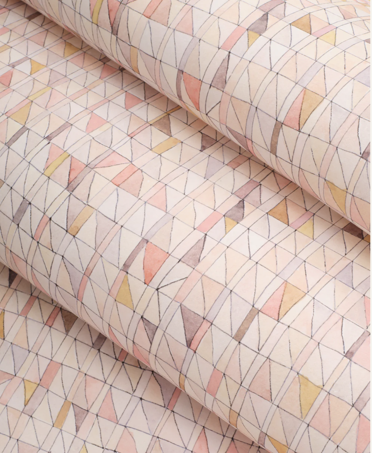
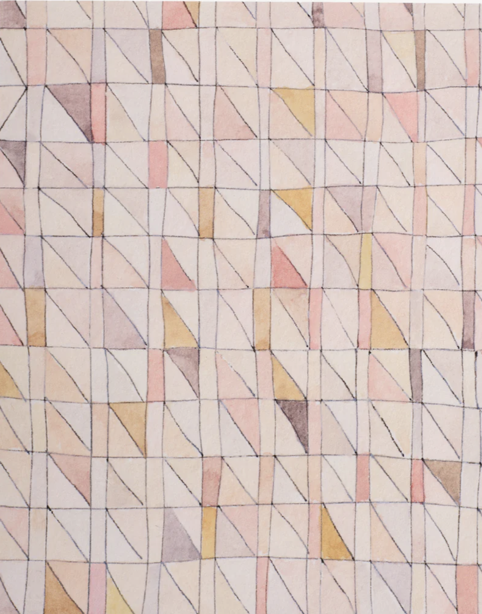
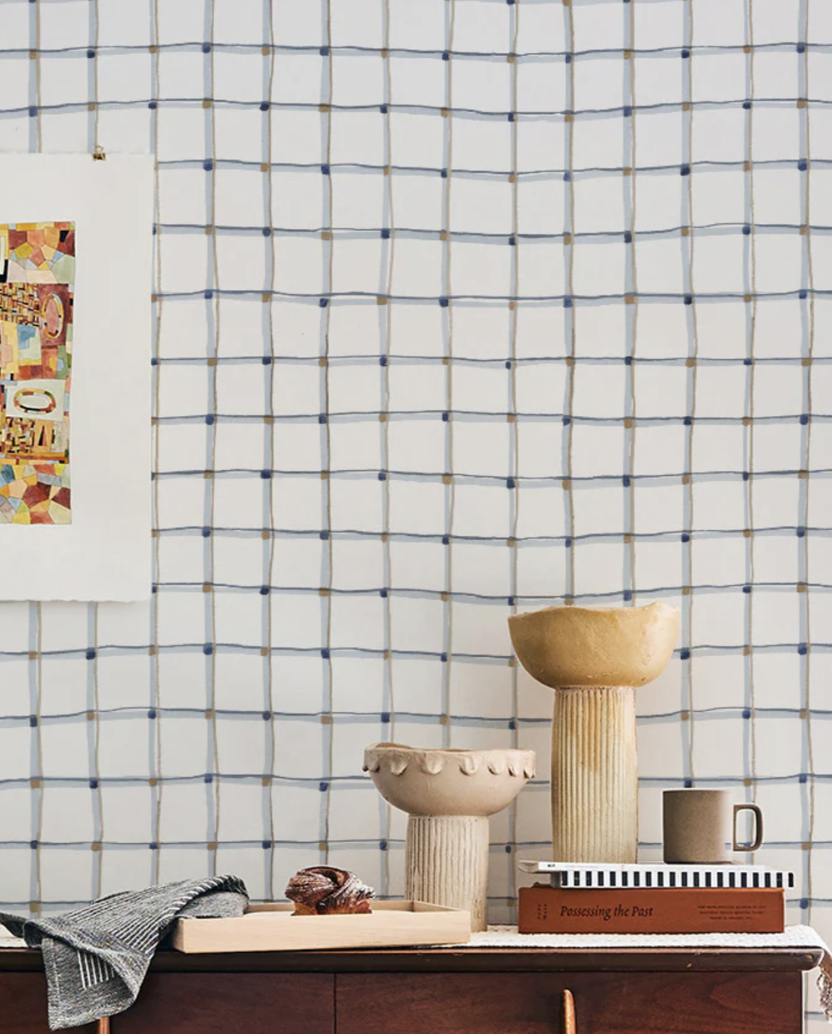
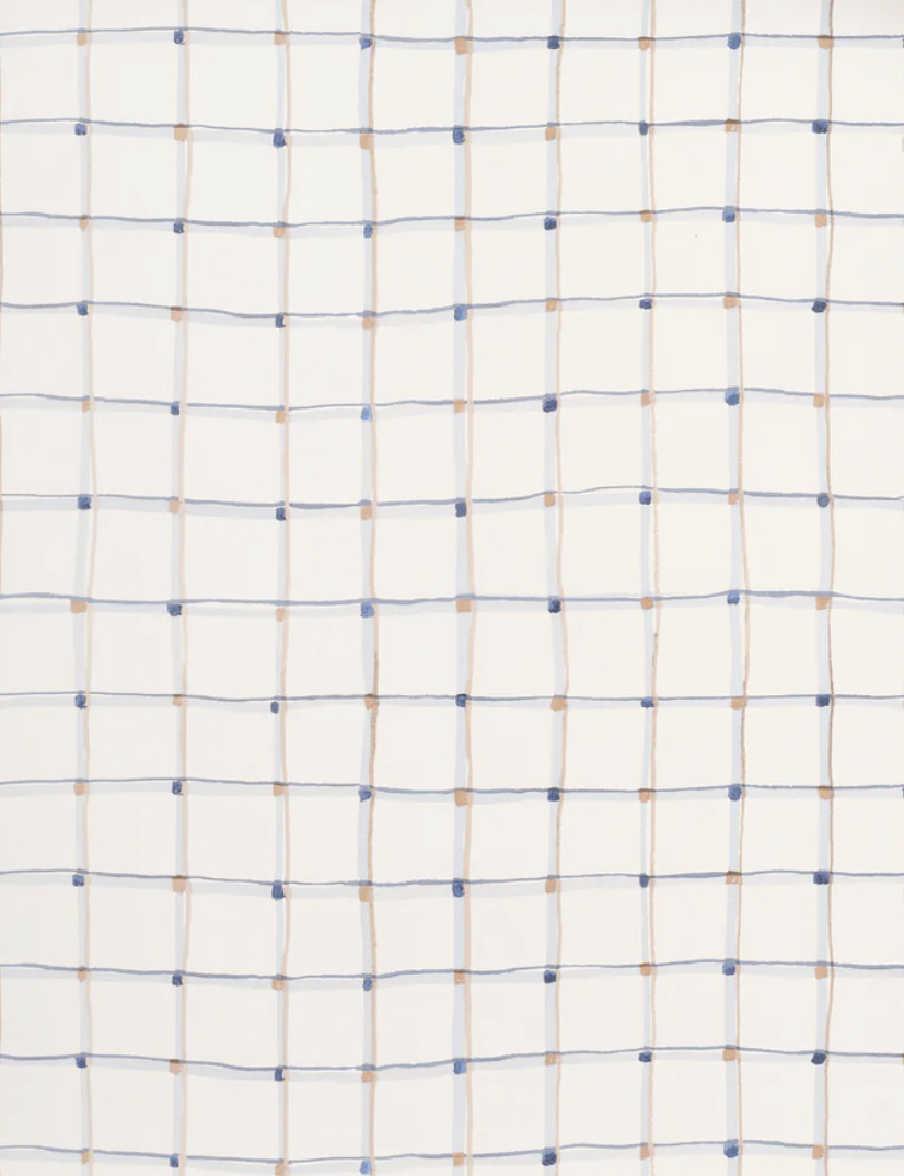
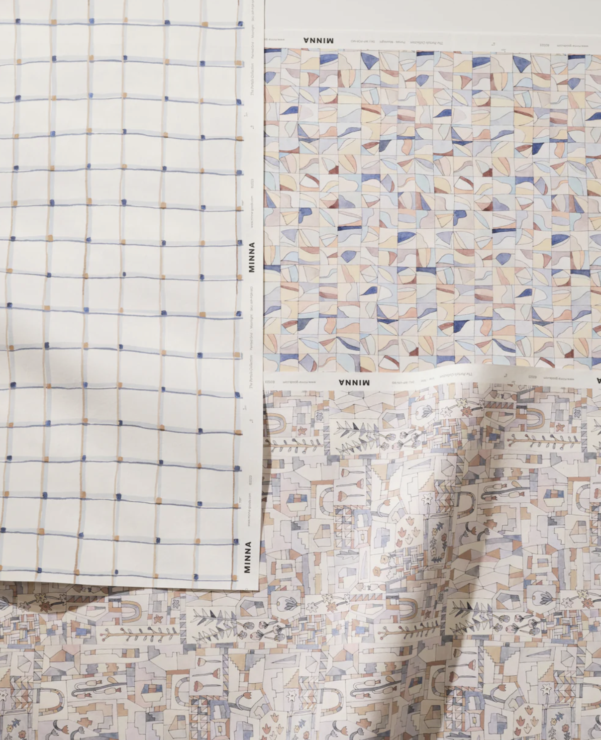
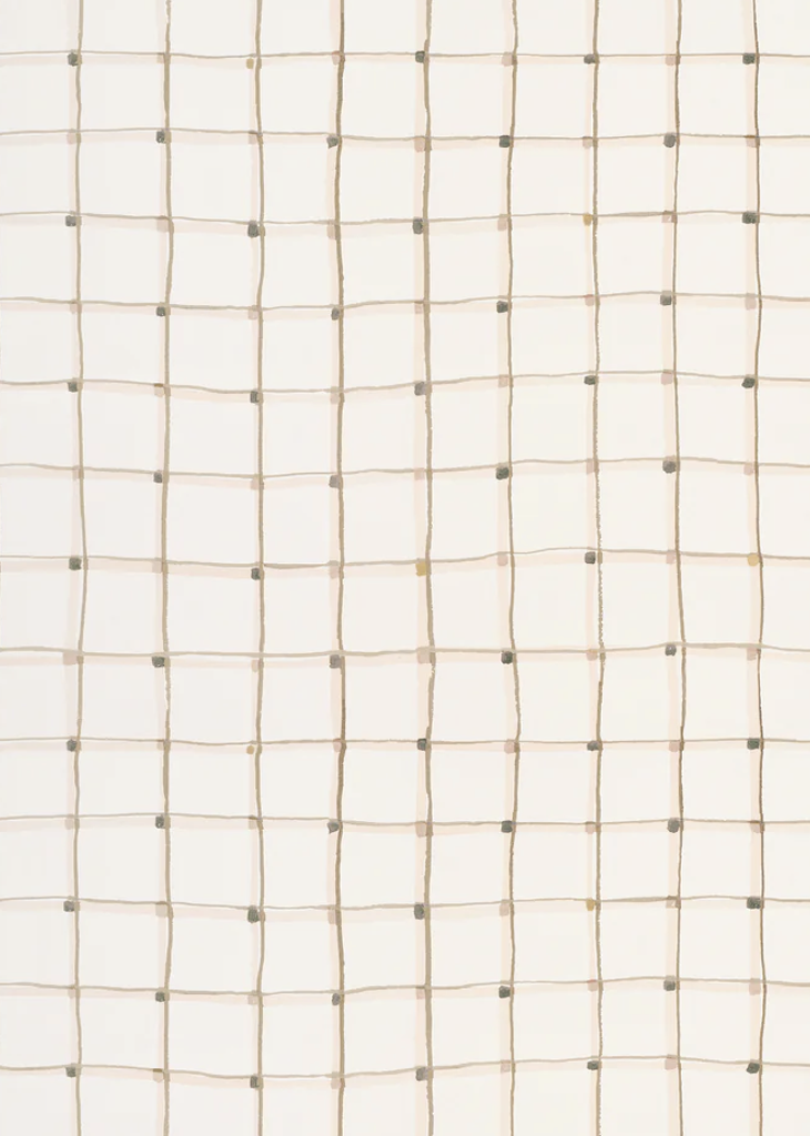
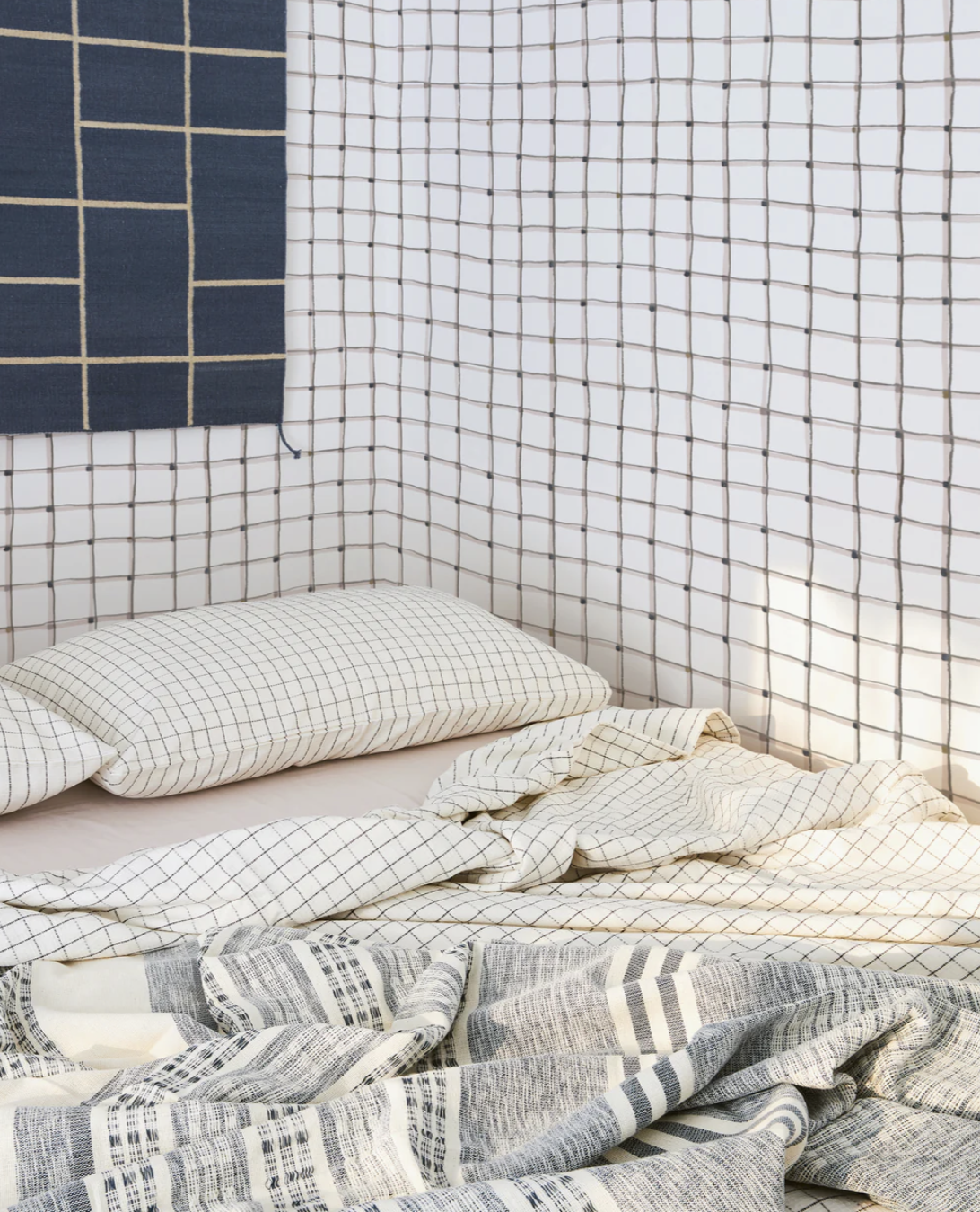
The Portals Collection is MINNA’s debut assortment of hand painted, sustainably printed fabrics and wallpapers. Each style is a glimpse into founder Sara Berks’ painting practice, aptly referred to as portals: a watercolor world of architecturally abstract shapes, illustrative florals, quilt-like patterns, and rich color palettes. For the past 10 years MINNA has been dedicated to producing handcrafted textiles and goods for the home deeply rooted in artisanal techniques. As the brand expands to include wallcoverings and printed fabrics, they continue to remain committed to sustainability and responsible design. MINNA’s wallpapers are sustainably printed on a non-woven fibre paper that’s matte and textural, and this ground is close to the watercolor paper that Sara paints on. Fabrics are printed on 100% Irish Linen grounds. The collection is printed less than 100 miles from the MINNA showroom in Hudson, NY, and utilizes state of the art digital pigment printing techniques resulting in no wastewater. The collection is sold by the yard and printed to order, which ensures waste reduction and allows for flexibility in ordering. We welcome you into this portal — a new world for MINNA— and we are thrilled to carry this line in Colorado. Trade pricing is available for qualified members.
Maker Spotlight: Edie Ure
Boulder, Colo.-based Edie Ure is a fashion and interior designer and sustainable fashion educator with a strong background in surface design and natural dyeing. Her wallpaper line features inspiring designs made from sustainably foraged flowers and other natural materials.
How did you get your start? I studied fashion at Central Saint Martins in London and worked part time for a Japanese designer, Kojhi Tatsuno, who gave me an opportunity to create textiles for his collection in Paris. I have been designing prints and dyeing textiles for different designers ever since. When I moved to New York City, I designed prints for Calvin Klein Home Collection and worked in-house for Ralph Lauren Home, creating mood boards and sourcing vintage.
Wildflower No. 6 is created from pressed dried weeds and flowers, gathered from the Foothills of the American West.
When I moved to Colorado, I started gardening. Growing flowers and vegetables gave me a deeper respect for nature and our environment. I began exploring the world of natural dyeing and the colors that can be coaxed out of bark, weed, flowers, and organic food waste. Natural dyeing gave me a window through which I could understand nature more thoroughly.
Abiquiu is painted with earth pigments gathered from riverbeds and rocks in New Mexico and Colorado. It’s a love letter to all the red earth trails we have climbed.
What does your creative process look like? I am a bit all over the place, which is how I approach many things. One week I may be teaching workshops, and another dyeing yarn or fabric or making pillows for my collection of naturally dyed silk velvets. When I have the time, I’ll sit down and start pulling together some ideas for patterns using the bits and bobs I have collected or images I have taken.
My goal is to design for a serene natural environment. I feel there is a longing for that despite our urbanized lifestyles.
Where do you find inspiration? I tend to get creative blasts when I’m out gardening or on long walks with my dogs in the mountains. I take pictures as I go, often of rocks, moss, flowers, trees, and people. And when I get home, my pockets are always full of seed heads, soot, or clay that I use for drawing. I also often find myself with delicate flowers to dry for use later.
The new Wild Plum.
My goal is to make my textile and wallpaper designs using only the things in the ecosystem around me.
Though Colorado is a very different environment from the one I grew up in, I have become attuned to its beauty, including the subtle palate of grasses, trees and wildflowers.
Best piece of advice you've received in your career?“ What you do makes a difference, it is up to you to decide what difference it will make.” – Jane Goodhall
And this quote from Luis Barragán also rings true for me: “I think the ideal space must contain elements of magic, serenity, sorcery and mystery.”
Professional accomplishment you are most proud of? It makes me proud when I see my designs pop up in people’s lives and somehow make their lives brighter. I have a friend who is a chef, and whenever I see videos of her cooking in front of my wallpaper it gives me a thrill.
Most rewarding aspect of your work? I really love teaching. It is so rewarding to see people catch a creative spark and create work they’re proud of.
Who are some of your design inspirations? Mother Nature in all her wild forms, along with Andy Goldsworthy and Japanese and Korean folk art, textile design, and architecture.
Favorite podcast? “The Great Women Artists”
Childhood dream job? Photojournalist
Drink of choice? Earl Grey tea with a splash of milk
Ikat by Edie Are
Wild Plum by Edie Ure
Spotlight: Stephanie Waddell of Istoria Interiors
I’m always on the hunt for creative and unexpected applications of wallpaper; I love seeing traditional patterns in modern spaces, modern papers in historic environments, and the use of wallpaper in places other than the walls! Personally, I would not have thought to use House of Hackney’s MeyMeh- a pattern that evokes a Moroccan souk- on a farmhouse door inside a modern Boulder home, but that’s exactly what Stephanie Waddell of Istoria Interiors did. And it looks amazing!
A friend of mine had put me onto Stephanie’s previous venture, Agnes & Hoss, a textile design brand which produced handbags, pillows, scarves, lighting, and a full gift collection. The company manufactured goods both domestically and internationally, which were sold through hundreds of stores nationwide, including Anthropologie and ABC Home.
In 2010, Stephanie, who was driven by a desire to live closer to nature, left Chicago and moved with her husband and son to Boulder, Colorado. She says, “it was at this point that I decided to transition into interior design. I became increasingly passionate about how we live and navigate space, and I was consumed with the belief that people should love the spaces where they live, work, and socialize. These interiors should be filled with meaning, emotion, and humanity.” Stephanie is currently earning her MFA in Interior Architecture and Design, and simultaneously creating fully conceptualized spaces through her firm, Istoria Interior Design.
The firm’s name comes from an Italian Renaissance term which refers to the complex narrative that can be found in a painting. This dovetails perfectly with Stephanie’s belief that every interior should have a story and a philosophy behind it. She believes, “the only way to fill a space with soul is to fill it with narrative. It’s not enough to make interiors functional and beautiful; a good space should spark emotion, invite dialogue, and make people curious to learn more.” Stephanie takes risk with colors and patterns, and encourages her clients to do the same by taking a chance on the unexpected. That’s a design philosophy we can get behind, 100%.
Photos courtesy of Stephanie Waddell, used with permission. For more on Stephanie’s work please go here:
Hackney Empire, used in one of Stephanie’s most recent projects. Paper sourced by WallTawk. PC: Jodi S.
Classic! We love this paper so much, great pick Stephanie. PC: Jodi S.
December Mood Board: Terrazzo
Terrazzo, the famed composite material that is used in flooring and wall applications, is popping up everywhere (and we’re so happy to see it making a comeback). It consists of, “chips of marble, quartz, granite, glass, or other suitable material, poured with a cementitious binder (for chemical binding), polymeric (for physical binding), or a combination of both.” [1]
Ancient Egyptians created beautiful mosaics, but the origins of terrazzo - which means terrace in Italian- are uniquely Venetian, developed in the 15th century. “Workers were left with oddly shaped pieces of marble after jobs,” and they would put the small marble rocks in clay and grind them flat for a more comfortable walking surface.
Terrazzo came to the United States in the late 1700s (numerous monuments and historic buildings feature terrazzo flooring–including George Washington’s home, Mt. Vernon ) and began showing up more frequently during the 1890s. But terrazzo did not achieve wide-spread popularity until the 1920s, during the Art Deco and Moderne periods of design. “Due to its likelihood of cracking, terrazzo was used at a small scale in comparison to the large expanses we see today.” There were 2 inventions that resulted in the material’s rise in popularity: divider strips (they contained the cracking of terrazzo by allowing it greater space to expand and shrink) and the electric grinding machine (which cut down on production time, thus making the material a more affordable flooring option). [2]
During the mid-1960s “thin-set, or epoxy based terrazzo was introduced,” and by the early 1970s it made up around 30% of all terrazzo being installed nationwide. At some point the use of terrazzo began to dwindle, but today we are seeing a rise in both its popularity and its applications. Here are some of our modern favorites:
Max Lamb for DzekDzek, bathroom design by Tali Roth.
Tiles from Lindsey Lang.
Bob Lamp by Talbot & Yoon.
Spot on, via SightUnseen, and more of Carly Jo Morgan’s terrazzo (I’m flipping out!).
Chen Chen and Kai Williams, lighting.
Omar’s Place, designed by Sella Concept.
Design by Tali Roth.
I enjoy traveling, photography, hiking, street art, design, architecture, food trucks, gardening, the cosmos, cooking with the seasons, political activism and wallpaper! I know my interests span a variety of categories, here's where they all come together.

